Android development for different form factors
Amount of different types and sizes of screens on android devices has increased in recent years, devices come in all shapes and sizes nowadays. More than 250 million large screen devices are already in use. To provide a better experience for your users, the design of your app should not be tied to a specific form factor like 6-inch handsets. Developers are not taking enough advantage of the increasing range of form factors, apps should also include support from large-screen tablets to foldable and dual-screen devices.
There are untapped opportunities to optimize apps for large screens and foldables, and improve experiences, and deliver positive business results. Many apps still lack full potential which can be achieved by using responsive layouts that adapt to tablets and foldables, in addition to traditional smartphone form factors.
The large screen, dual screen, and foldable devices provide your application the opportunity to enable multitasking, display more content, and create improved experiences not possible on traditional smartphones.
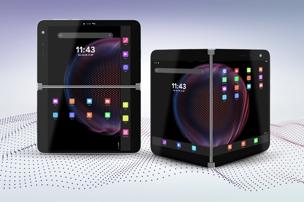
Foldable and dual-screen devices are no longer experimental or futuristic, and your application is used in more devices with non-traditional form factors.
Responsive layout – ConstraintLayout
For developers to adapt to an increasing range of hardware configurations your layout should respond to different screen sizes and orientations, which will not only provide a better user experience but also enables using a single APK or AAB.
Foldables can also change posture while being used, which will impact your application while active. Changing posture changes the size and/or aspect ratio of the display and content panes. Providing a significantly enhanced user experience for your users.
One of the best ways to create a responsive layout for different screen sizes is to use ConstraintLayout as the base layout in your UI. It allows you to specify the position and size for each view according to spatial relationships with other views in the layout. This way, all the views can move and stretch together as the screen size changes. Constraint helps to reduce the hierarchy of views and increase the layout performance and flexibility.
The fundamental building block of ConstraintLayout is creating constraints. It defines a relationship between two widgets in the layout and controls how those widgets will be positioned within the layout.
ConstraintLayout is the default layout used in Android Studio due to its simplicity and flexibility. This allows you to create large, complex, dynamic, and responsive views in a flat hierarchy. ConstraintLayout was built from the ground up to make it easier than ever to build an Android UI. Once you drag-and-drop a view into ConstraintLayout, you can add constraints to define the view’s position by dragging an anchor line to other elements in the layout. The layout editor can also intelligently infer the constraints for all views with a single click.
With existing code, it is easy to convert layouts to ConstraintLayout. Just add ConstraintLayout to your project and convert a layout to ConstraintLayout within Android Studio.
ConstaintLayout is one of the most popular Jetpack libraries, which ship separately from the Android OS. In the ConstraintLayout 2.1 release, several features were added to help manage foldable devices, including SharedValues, ReactiveGuide, and enhanced support for animation. To add a dependency, you must add the Google Maven repository to your project.
Jetpack WindowManager for large screen and foldables
Jetpack WindowManager is one of the latest additions. It is similar to Android WindowManager, but adds support to new types of devices like foldables. Jetpack WindowManager library will help application developers support a wider variety of device form factors, by providing a device-agnostic way of reacting to device modes, configuration changes, and display features.
Foldable devices can have different configurations and features like folds, hinges, curved areas. These disruptions are important to take into account in application development. Layout and placement of the content in the window should avoid disruptive areas, or take advantage of them as a separator.
Jetpack WindowManager key features are:
- WindowMetrics provides a simple way to query for metrics about the current window or the display.
- WindowLayoutInfo contains the list of display features within the window, like fold or hinge. The interface will report only the features that are present within the current window bounds. Features, positions, and sizes can change if the window is moved or resized on the screen
- FoldingFeature provides the current posture of the phone and calculates The FoldingFeature offers device-specific information, location, and boundaries, that enables a single code base to adapt to different dual-screen and foldable devices.
When running your application on a foldable device, the above libraries will help developers identify device-specific UI boundaries and can align the UI of their applications to work flawlessly with different form factors.
The conclusion is that the Jetpack WindowManager library helps developers to create apps that are aware of new device features, and provide experiences for end-users that didn’t exist before.
Build for the future
Manufacturers are constantly introducing devices with non-traditional form factors. Developing your application to support a wide variety of Android devices, from the same codebase, will not only provide a better experience but will also increase your customer satisfaction.
Android has released multiple libraries and toolkits to simplify and accelerate UI development for multiple form factors. Developers do not need to rebuild apps, you can gradually migrate from for example your existing View-based UI.
In this article we talked about only two libraries, that can help you to develop applications to take advantage of the different types of android devices. Please read more at:
We will talk more about design in our future blogs, where we will focus on the designer’s perspective on creating apps for multiple form factors and taking advantage of different form factors.
If you would like to learn more about designing and developing for multiple form factors, watch our event recording that in-house experts & engaging guest panelists were invited.
Want to talk more? Contact us.